
Background
SPADE is a powerful tool for the representation of an entire dataset as a two-dimensional clustered tree. This article overviews how to analyze a completed SPADE analysis and work with the tree visualization.
Click the links below to jump to the relevant section in this article:
- Discussion on SPADE Tree Structure
- SPADE Trees are Random but Results are Consistent
- Interpreting Structure and Arrangement of the Tree
- Color Clusters by Channel to Find Phenotypes
- Consolidate Similar Clusters into Bubbles
- Dynamically Visualize SPADE Clusters on 2D Dot Plot
- Set SPADE Tree Statistics with "Metric"
- Tree Visualization Controls
- Global / Local Coloring Range and Coloring Symmetry
- Tree Color Scheme and Background Color
- Cluster Size Range
- Merge Clusters Together
- Analyze SPADE Statistics
- Export SPADE Tree Images
- The Significance of Empty Clusters
- Access SPADE clustering result from a SPADE child experiment
- Next Steps: Export Bubbles as New FCS Files for Bulk Statistics and Visualization
Discussion on SPADE Tree Structure
SPADE Tree structure is stochastic but results are consistent
It is often noted that SPADE trees "turn out different every time", and this observation is correct. The actual presentation of a SPADE tree will change between runs, and the structure and arrangement of two SPADE trees can't be directly compared across runs. Despite this situation, however, the results of a SPADE run will be consistent between runs. For example, if the goal is to phenotype and characterize cell types within the blood, 10 SPADE runs on the same data set will produce highly similar results. I.e., the relative event counts and signaling profiles of bubbled populations will be comparable for each run. The trees will look different, but after analyzing each one, the takeaway results will be the same.
Conclusions to make from SPADE tree structure and arrangement
Three components can be considered for SPADE tree structure: clusters, edges, and cluster location. Edges are what connect clusters. In SPADE, the location of individual clusters cannot be used to draw conclusions about similarity between clusters. Only the connections (via edges) between clusters can be used for this purpose. In such analysis, edge length is meaningless. Only the number of edges, or "steps", on a path between any two clusters is of consequence. When two clusters have fewer steps between them on a SPADE tree, this means that these two clusters contain events that are similar to each other as analyzed across all the channels included in the SPADE run. Conversely, more steps between two clusters on a SPADE tree indicates underlying differences between the events within those clusters.

(these two arrangements of the same snippet of a SPADE tree are completely equivalent, though the left is certainly easier to interpret. In line with the concepts above, cluster 7 is more similar to cluster 81 than cluster 81 is to cluster 85, and on the right, cluster 85 is not similar to cluster 37 simply because of their proximal location.)
One thing to consider when applying the concepts discussed above is that SPADE trees go from a multidimensional data distribution down to two dimensions, and certain sacrifices have to be made during this process that might render similar populations further apart from each other on the SPADE tree than one might expect, much like Alaska and Russia are close together on a three-dimensional globe, but might be rendered far apart on a two dimensional map.
Color Clusters by Channel to Find Phenotypes
The core workflow to analyze the SPADE tree is to color it by channel. To color the tree by channel, simply use the up/down arrows on the keyboard or find the Node Color Parameter drop-down menu within the SPADE interface. This menu is populated with channels from within the sample file currently being viewed:

When a channel is selected in this menu, each cluster in the SPADE tree will color itself according to a summary statistic of the events within the cluster on the channel selected. The color/statistic will depend on the selected metric, but in the default case, the clusters will be colored by the median expression level of the events within the cluster on the selected channel. Here is an example SPADE tree for a four-color dataset:
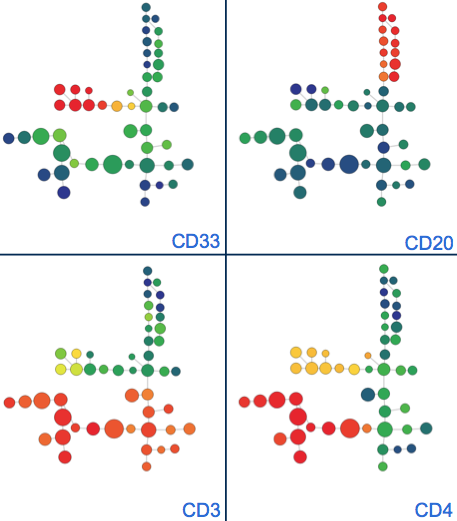
(example SPADE tree for a four-color fluorescent dataset colored by each channel that contributed to clustering. Classical phenotypes emerge and can be bubbled to consolidate them)
To color the tree for fold change visualization, the SPADE tree metric must be set appropriately.
Use Bubbles to Consolidate Similar Clusters into Groups
Bubbles serve as a way to assign human-decided population thresholds to the various computational populations (clusters) found by SPADE.
The example SPADE tree directly above could be bubbled in this fashion to organize the numerous computational clusters into major classes of phenotype for analysis and summary reporting:

(example SPADE tree bubbled according to major phenotype categories - note that the SPADE tree can only be colored by one channel at a time but bubbles help track previously established groups)
Bubbles can be applied to any group of clusters. Interaction tips:
- Use the mouse to select clusters to group together. Click the Add Bubble button. You'll be prompted to enter the name for that grouping of clusters.
- To add other clusters into the bubble, simply drag and drop them into the bubble.
- To remove clusters from a bubble, select the clusters, hold down the shift key, and drag them out of the bubble.
- Multiple individual clusters can be selected in succession by clicking on them individually while pressing the shift key, or by serially highlighting groups of clusters by clicking and dragging across them with the shift key held down.
- Groups of selected clusters can be rotated by clicking the Rotate Selected Nodes button or by pressing the 'Z' key on the keyboard.

(click to begin - animation example of adding and interacting with bubbles and clusters)
Dynamically Visualize Clustered Events on a 2D Dot Plot
SPADE is a great way to analyze data, but sometimes it is necessary to get a view back to the raw data while analyzing to get an understanding of what events are in each cluster. This workflow is supported with the biaxial dot plot located to the left of the SPADE interface. Anytime a cluster or group of clusters is highlighted within the SPADE tree, the events within these clusters will be displayed on the biaxial plot. Multiple biaxial plots can be open at a time by pressing the button to pop out additional plots. Different plot types can be selected on the plot. Contour - Color by Density is a useful plot type because it shows outlines of events that aren't currently selected. See the example below:

(click to expand - example of using the 2D dot plot to analyze events within clusters)
Configure Global / Local Coloring Range and Symmetry
There are two components to setting the coloring range of the SPADE tree, which is shown in the top left of the SPADE interface.
Coloring Range (called "Scale Range" in the SPADE interface) can be set to Global or Local. In global mode, the range of the color bar is standardized across all files. In local mode, the range of the color bar is tailored to the file being currently viewed. In both cases, the minimum and maximum bounds of the color bar are set to be the 2nd and 98th percentile values in the channel being analyzed, but the scope of the data from which these percentile values are drawn changes depending on the global/local setting. Global is recommended in most cases since local scaling can be misleading when comparing multiple samples to each other.
At this time, the coloring range cannot be set manually by the researcher.
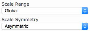
Coloring Range Symmetry (called "Scale Symmetry" in the SPADE interface) can be set to Asymmetric or Symmetric. In asymmetric mode, the range of the color bar will be set as defined directly above by the 2nd and 98th percentile. In symmetric mode, the color bar min and max will be set to the same value in the positive and negative, depending on which the greater of the absolute values of the 2nd and 98th percentile. Asymmetric is generally recommended.
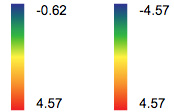
(asymmetric versus symmetric color bar range)
The SPADE tree itself can be colored in a variety of ways, including different backgrounds:

(the dropdown menus for tree and background color)

(example animation of various combinations of tree color and background color)
The size of a SPADE tree cluster is proportional to the number of events in each cluster. The dynamic range of cluster size can be configured using the slider. This size range can be set uniquely per sample file (Local) or to be the same across all sample files (Global) using the range selector below the range slider:

(example animation of altering cluster size range)
In addition to or instead of using bubbles it might be desired to simply merge clusters together. This can simplify visualization and reporting. Unfortunately, this functionality is not currently available.
SPADE produces a large amount of statistics and metadata. Read the dedicated article: Download SPADE Data and Statistics.
Read the dedicated article: How to Export Images of a SPADE Tree
The Significance of Empty Clusters
When visualizing or analyzing statistics for a SPADE tree, empty clusters are sometimes observed. This means that the sample being observed is missing a population of cells that a different sample in the SPADE run has. Put another way, there are events in the n-dimensional space of a sample in this dataset that are not present in the sample currently being viewed. Empty clusters can only occur when multiple samples are being analyzed in the same SPADE run. This is potentially an interesting finding if it is unexpected! Try navigating through the samples in the analysis and finding the sample(s) where the cluster is not empty. The events within the cluster can then be analyzed to see why they are unique in this sample compared to other samples.
Access SPADE clustering result from a SPADE child experiment
After each successful SPADE run, Cytobank automatically creates a child experiment to house SPADE clustering results. The SPADE child experiment contains new FCS files with 'cluster' and 'density' channels written in. To access this child experiment, click the “View created experiment” link from the frozen setup page for the SPADE run.
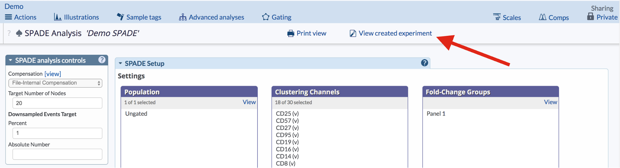
(Click the “View created experiment” to access SPADE child experiment.)
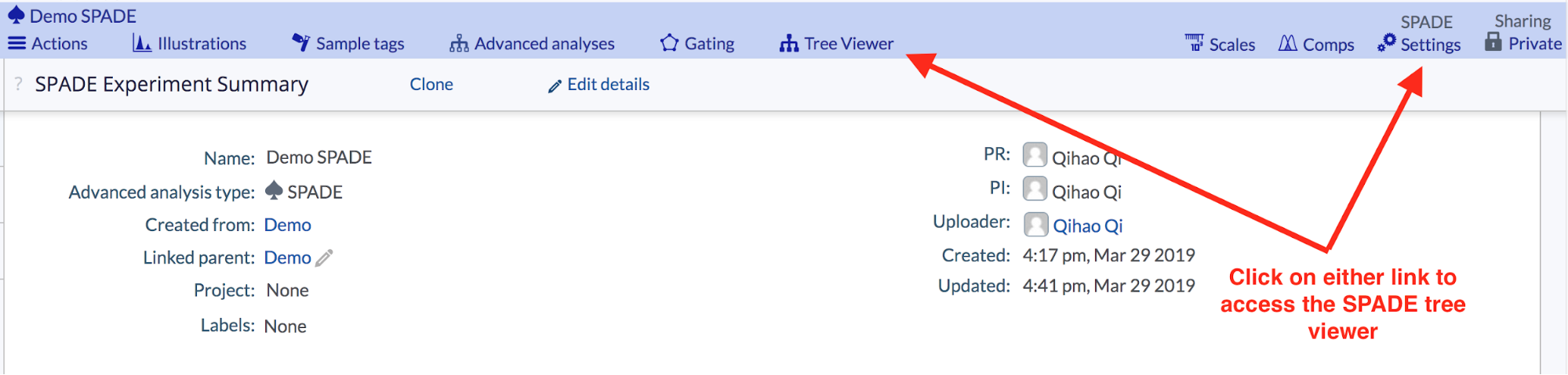
To access the SPADE tree viewer, click the SPADE Settings link on the right side of the blue experiment navbar, or the Tree Viewer link to the right of the Gating button, or the Tree viewer link from the Experiment Summary Page.
(In a SPADE child experiment, click the “Tree viewer” or the “Settings” to access SPADE tree viewer)
Export SPADE Bubbles as New FCS Files
After a SPADE tree has been analyzed it can be useful to export the bubbles into new FCS files. This worfklow has various uses to help with downstream visualization of results (e.g. with heatmaps and dot plots) and export of batch statistics for bubbles instead of for each cluster alone. Read the dedicated article: How to Export SPADE Bubbles to FCS Files for Statistics and Visualization