
Background
Once you have successfully trained a new automatic gating model you may want to assess its performance before using the model to run inference on other samples. If you selected the Create experiment with blind test files and their inferred populations option, you can also visually evaluate the model performance. After running inference using an existing model, you can access the analysis for visualization of the results and for downstream analyses.
This article outlines methods and considerations for assessing the automatic gating model quality, evaluate the results on the test set and interpret the model inference results. Click the links below to jump to the relevant section:
Evaluate the performance of an automatic gating model
Interpret the inference analysis results
Downstream analyses using the populations automatically generated
Evaluate the performance of an automatic gating model
Analysis run info
Once an Automatic gating model training is completed, the setting up page is updated to the analysis complete page where you can view the run info and the algorithm settings. The Analysis run info window shows the total run time and the Key Performance Indicator or KPI of the model. This KPI could help you evaluate the performance of the model training. You may check out the article on how to set up a new automatic gating analysis by training a new model to find out more on optimizing training a new model.
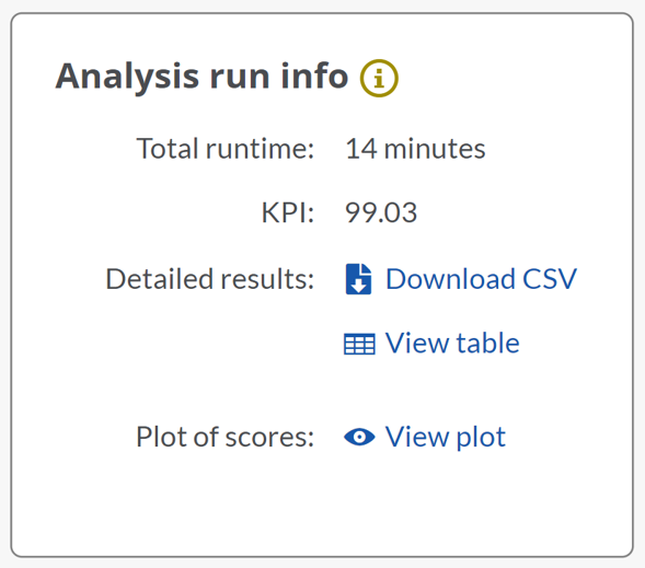
(Automatic gating training new model analysis run info window showing total run time and KPI)
The KPI for an automatic gating model is the weighted average of the F1 scores of all predicted populations. The KPI can be used to compare models trained on the same panel and gating strategy. The F1 score is the weighted average of precision and recall.
Precision measures the percentage of events predicted to be part of a population that are true positive events considering any false positive events. For instance, the percentage of CD4+ T cells identified by the model as CD4+ T cells, divided by all events classified by the model as CD4+ T cells, independently if they really are those cells (true positive events) or not (false positive events).
Recall is a sensitivity measure and indicates the percentage of true positive events that are accurately predicted. Therefore, it takes into account any false negative events. An example would be the percentage of CD4+ T cells identified by the model as CD4+ T cells, divided by all the real CD4+ T cells classified correctly (true positive events) or not (false negative events).
To determine the KPI of a model, for every event of the test set and for every population that is part of the model training, the Cytobank platform determines if the user and the automatic gating model classified the event as belonging to the same population or not.
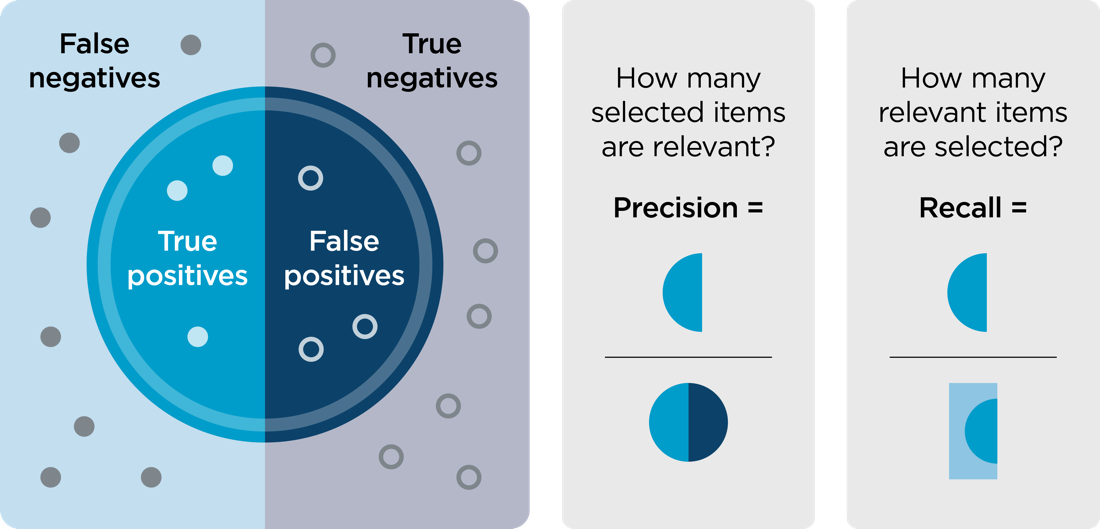
(Visual summary of precision and recall)
As an output of the model training, you can download a table by clicking on the Download CSV option or visualize it on the platform selecting View table. The table shows the following information for every population for the test dataset:
- Actual: this is the number of events included in this population based on manual gating.
- Predicted: this is the number of events included in this population based on automatic gating.
- True positives: number of events that have manually been defined as belonging to this populations and that have been automatically defined as belonging to this population, overlap between actual and predicted.
- Precision: number of true positive events divided by the number of all predicted events in an automatically defined population in percentage, high precision indicates a low number of false positives or type I errors.
- Recall: number of true positive events divided by the number of actual events in a manually defined population in percentage, high recall indicates a low number of false negatives or type II errors.
- F1 score: harmonic mean (or weighted average) of precision and recall for a population, it balances precision and recall and is calculated as:

As a general guideline, F1 scores above 90% are considered very good, between 80% and 90% good, between 50% and 80% ok and scores below 50% not good. If the F1 score for a given population is too low, you may check out the article on how to set up a new automatic gating analysis by training a new model to find out more on optimizing training a new model or review your manual gating strategy for the files used to train the model.
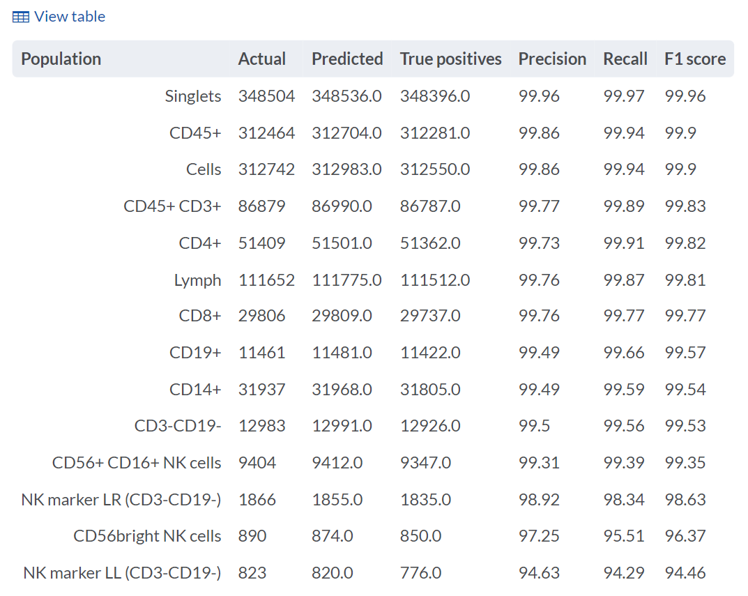
(Table of results for the Cytobank Automatic gating training analysis showing the actual, predicted, true positives, precision, recall and F1 scores for all included populations)
Note: If you are training a model with gating strategies that contain quadrant gates, situations may occur where one event is assigned to several quadrants in the trained model, and some events may not be assigned to any of the quadrants. The Cytobank platform treats quadrant gates comparable to four rectangular gates. The automatic training model, therefore, predicts whether or not a cell belongs to a population independently for each quadrant. For cells that appear unlike cells in the training dataset, this might lead to no population assignment from a set of quadrants. For cells that would fall on the edge between two quadrants, this may result in a cell being assigned to both populations. Treating all populations at the same hierarchy level independently rather than enforcing exclusive relationships provides you more freedom when developing your gating strategy.
You can visually inspect the output of the prediction scores by clicking on the View plot option. These box plots show the distribution of the F1 score across the files in the test set for all predicted populations.
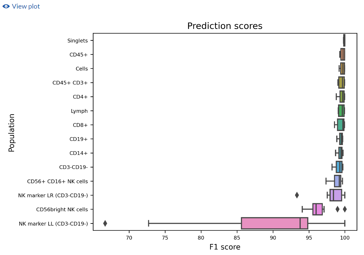
(Box plots of the distribution of the F1 scores for all files on the test set)
View created experiment with blind test files
If you selected to Create an experiment with blind test files and their inferred populations, you can access the child experiment containing the subset of FCS files that were assigned to the blind test set. To enter these results, click on the View created experiment tab on the analysis complete page.
![]()
On the Gating editor of the newly created experiment, you can see that for every automatically inferred population a new channel, a new gate and a new population are automatically generated. The nomenclature follows these guidelines:
- Channel: auto_gate_name of the population
- Gate: name of the population_auto_cluster_gate
- Population: name of the population [auto]
You can use the Population tree and the Population sunburst to explore the automatic populations and their hierarchy.
The Cytobank platform generates by default a new illustration named Autogating box plot of events counts. To access this illustration, navigate to the Illustration menu and select it from the list.
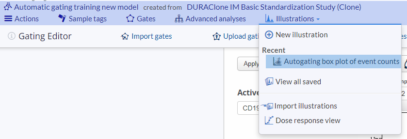
This illustration gives you an example of how the automatically identified populations can be used in a summary plot. If you cloned the gates, this allows you to easily compare the manual and automatic gating results as the default illustration shows the number of events belonging to all populations on the experiment (manually or automatically generated).
To evaluate visually the performance of two populations and easily spot a bias between the manual and automatic results, navigate to the Layout menu and deselect all Subgroups populations except the two that you would like to compare. You may want to switch on the Show dots and Show lines options on the Plots menu to visualize as dots the FCS files and connect them between the manual and automatic population. You can also run a significant test to assess statistically significant differences across the two populations. Note that this approach would only allow you to compare two populations at a time.
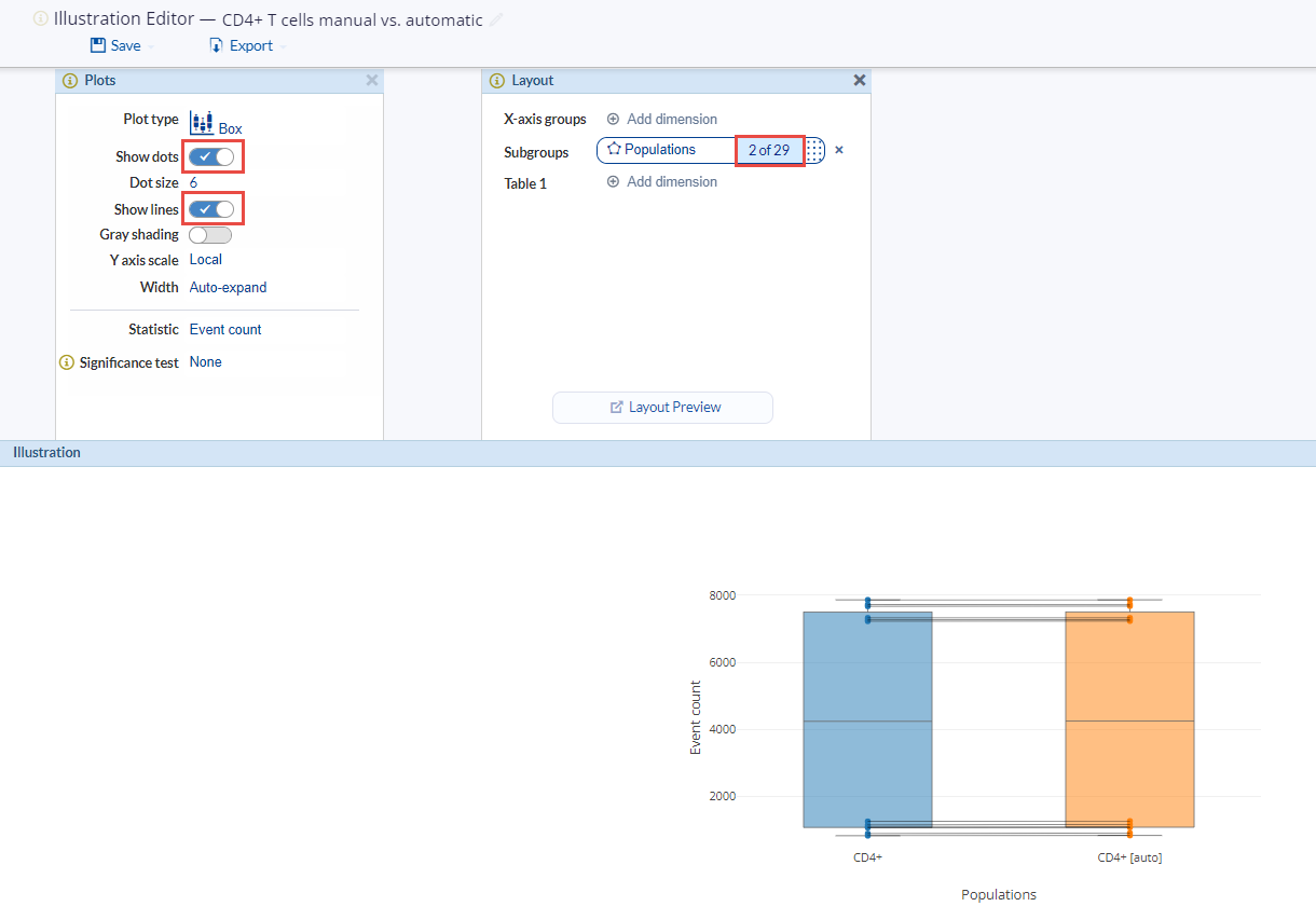
(Example box plot illustration comparing the event count in the CD4+ manually identified cells in blue and the automatically classified CD4+ cells in orange. Lines are connecting the same FCS file)
To evaluate model performance at the event level you may create a new dot plot illustration. To do so, navigate to the Illustration menu and select New illustration. To set up the illustration on the Plots menu select as the Plot type dot plots and toggle Overlaid on. On the Layout menu select Populations as the Overlaid position and choose the automatic populations you want to visualize. Use the Channels dimension to select multiple channels or adjust them directly on the illustration if you want to visualize only a single marker combination. If you have included the manual gates when creating the experiment, you can toggle Show gates on to directly compare manual and automatic population identification.
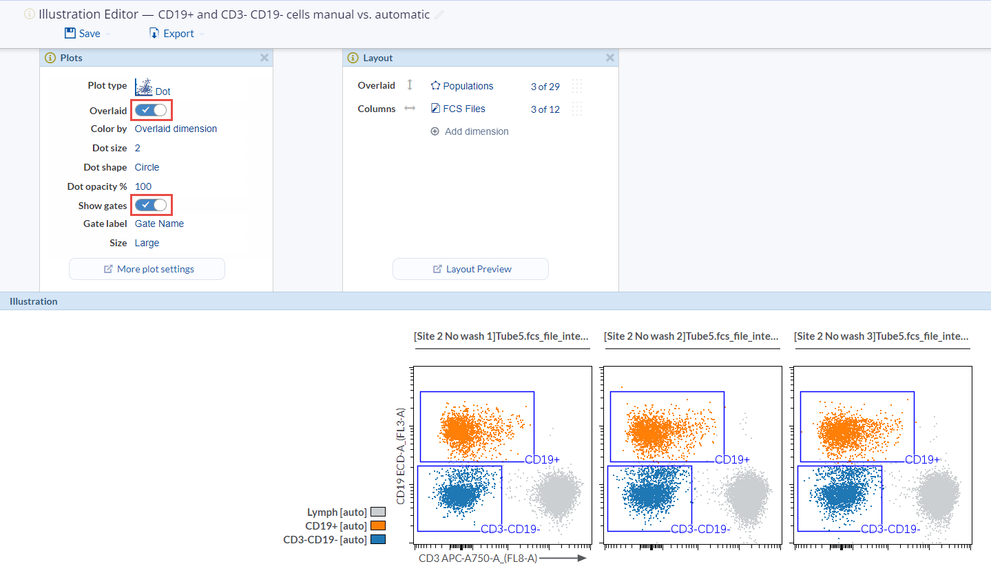
(Dot plot illustration comparing manual and automatic population identification on 3 FCS files from the test set. Dots are colored to reflect the automatic gated populations: lymphocytes in light grey, CD19+ in orange and CD3-CD19- in blue. The manual gates are shown as blue boxes)
You may check out this overview article and video tutorial on figure generation on the Illustration editor.
Interpret the inference analysis results
Once an open Automatic gating inference is completed, the setting up page is updated to the analysis complete page where you can view the algorithm settings and access the child experiment containing the FCS files with the results. To enter these results, click on the View created experiment tab on the analysis complete page.
![]()
Results on the Gating editor
On the Gating editor of the newly created experiment, you can see that for every automatically inferred population a new channel, a new gate and a new population are automatically generated. Populations are identified by cluster gates on the added channels. The nomenclature follows this naming convention:
- Channel: auto_gate_name of the population
- Gate: name of the population_auto_cluster_gate
- Population: name of the population [auto]
(Cluster gates for automatically gated populations visualized in the Gating editor)
You can use the Population tree and the Population sunburst to explore the automatic populations and their hierarchy. If you checked the box to clone the gates to the child experiment, you could also compare the manual gating strategy and the automatic gating results.
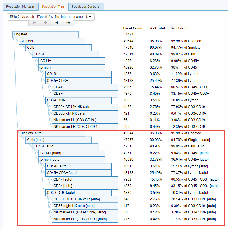
(Automatic and manual populations in the Population tree)
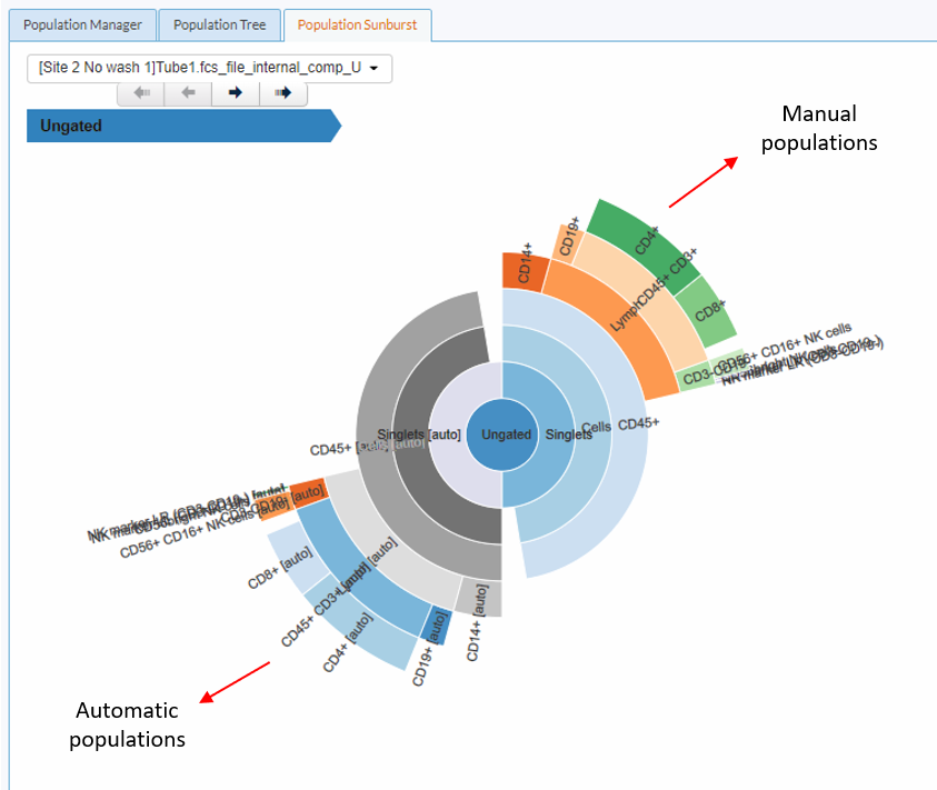
(Automatic and manual populations in the Population sunburst)
Results on the Illustration editor
The Cytobank platform generates by default a new illustration named Autogating box plot of events counts. To access this illustration, navigate to the Illustration menu and select it from the list. This illustration gives you an example of how the automatically inferred populations can be used in a summary plot. If you cloned the gates, this allows you to easily compare the manual and automatic gating results as the default illustration shows the number of events belonging to all populations on the experiment (manually or automatically generated).
To assess visual differences across the manual and automatic results, navigate to the Layout menu and deselect all Subgroups populations except the two that you would like to compare. You may want to toggle the Show dots and Show lines on in the Plots menu to visualize as dots each FCS file and connect manual and automatic populations using lines. You can also run a significant test to assess statistically significant differences across the two populations. Note that this approach would only allow you to compare two populations at a time.
To evaluate the populations automatically created at the event level basis you may create a new dot plot illustration. To do so, navigate to the Illustration menu and select New illustration. To set up the illustration on the Plots menu select as the Plot type dot plots and toggle Overlaid on. On the Layout menu select Populations as the Overlaid position and choose the automatic populations you want to visualize. Use the Channels dimension to select multiple channels or adjust them directly on the illustration if you want to visualize only a single marker combination. If you have included the manual gates when creating the experiment, you can toggle Show gates on to directly compare manual and automatic population identification.
You may check out this overview article and video tutorial on figure generation on the Illustration editor.
Downstream analyses using the populations automatically generated
Statistical inference using summary plots
After training an automatic gating model and running inference on all your FCS files, you can make comparisons across conditions, timepoints or any experimental variable that forms part of your dataset. First, use Sample tags to annotate all relevant experimental variables or dimensions. Then, create a new illustration (Illustration menu -> New Illustration), select one of the Summary plots and adjust the Layout menu positions to reflect your relevant experimental variables. Finally, you can add a Significant test to identify statistically significant changes.
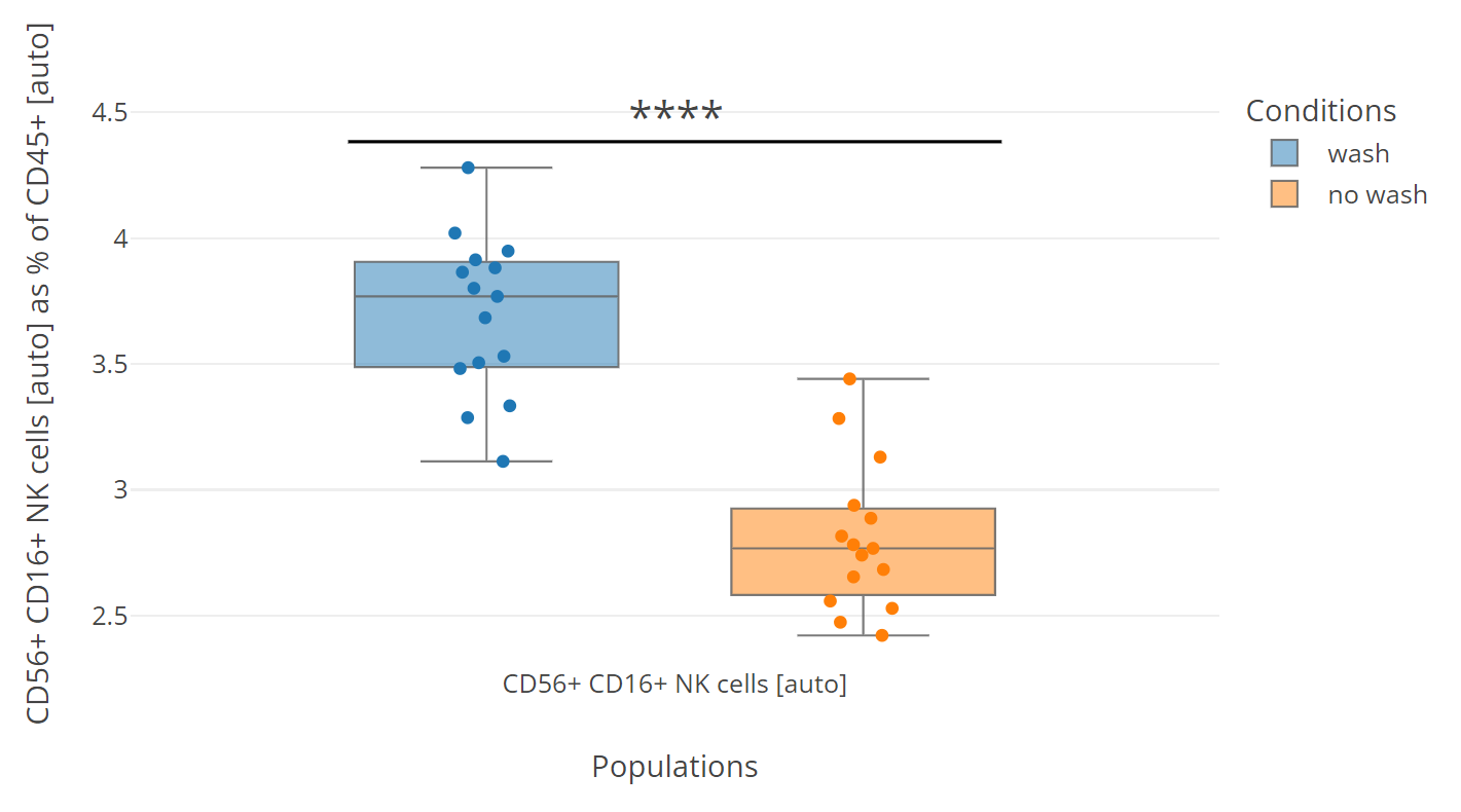
(Example use of the automatic gating inference results. Box plots showing the automatic population CD56+ CD16+ as a percentage of the automatic population CD45+ for 30 FCS files. The samples were separated by the experimental conditions, blue indicates washed samples and orange no washed samples. Dots point to each FCS file. A Student’s t-test was used to compare the two conditions. Significant differences were found with a p-value < 0.0001)
Visualization on a dimensionality reduction map
Dimensionality reduction (DR) algorithms provide a two-dimensional map representation of complex multi-parameter data facilitating a more comprehensive visualization of the data. You can backgate the populations inferred from the automatic gating algorithm to have a clear and comprehensive visualization of your dataset. To combine the inferred population results with DR, on your Automatic gating experiment navigate to the Advance Analysis menu and select a New dimensionality reduction analysis. You may check this article on how to configure and run a DR analysis or watch this video tutorial first. Once the analysis is complete select View results and Results in Illustration editor to access a new illustration. On the Illustration editor click on the Plots menu and toggle Overlaid on. On the Layout menu select the automatically inferred populations as the Overlaid dimension. You can use Sample tags to add the experimental variables to your experiment and create a more meaningful illustration.
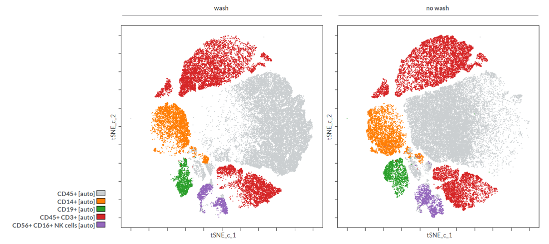
(Example of automatic gated populations backgated on a tSNE-CUDA map. Two FCS files corresponding to two experimental conditions, wash and no wash, are displayed. Grey = CD45+, orange = CD14+, green = CD19+, red = CD45+CD3+ and purple = CD56+ CD16+ populations)