
Background
This article provides instruction and discussion on using heatmaps (sometimes written "heat maps").
- Setting the plot type for heatmap
- Choosing markers / channels for display in the heatmap
- The heatmap visual depends on the selected statistic
- Setting the heatmap coloring range
- Data scaling for the heatmap visualization and statistics: raw vs transformed
- Mousing over a heatmap square shows the underlying data
- Dimension-annotated heatmap
- Exporting heatmap image to PowerPoint or PDF
- Heatmap clustering and dendrograms
1) Setting the plot type for heatmap
In the Illustration Editor, under the Plots tab, select Plot type: Heatmap. Make sure to select the appropriate channels and adjust the other dimensions as needed on the Layout tab and the new illustration will be automatically updated. The corresponding table of statistics will also be present under the heatmap.
(To turn your illustration into a heatmap, select the heatmap option from the Plots tab)
2) Choosing channels for display in the heatmap
A typical scenario when building a heatmap is to display samples or gated populations as rows and different markers of interest from within the data as columns. This figure allows the underlying expression profile of certain populations or samples to be explored:
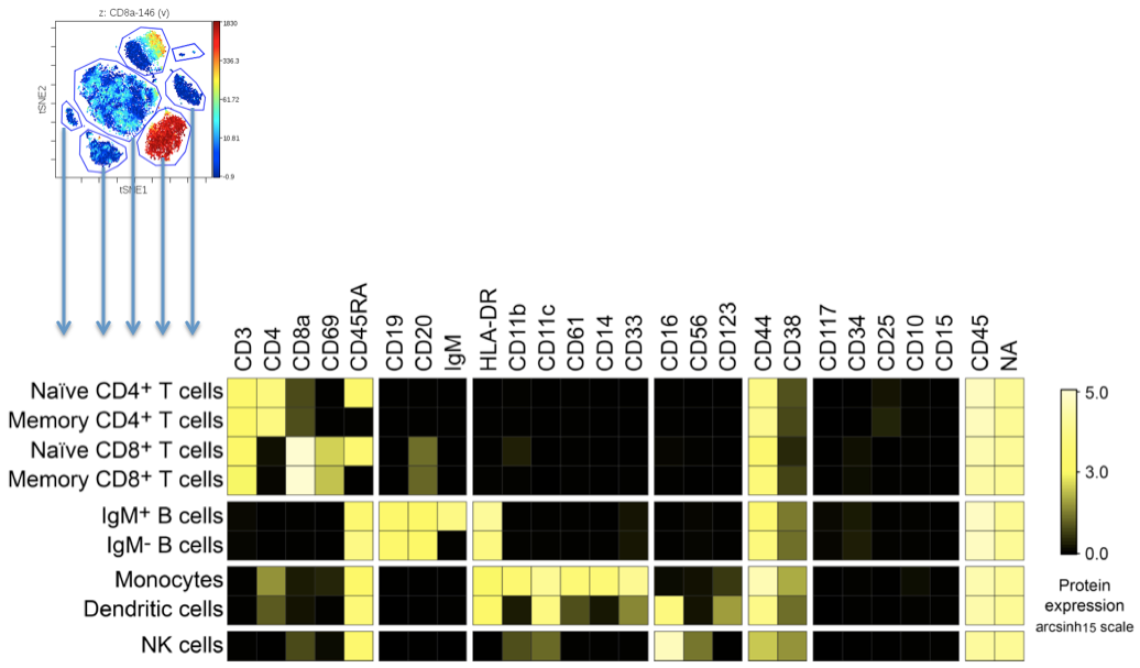
(Example of getting a multi-channel expression "fingerprint" from populations gated in viSNE)
In order to create a heatmap with multiple channels, populations and conditions, click on the Layout menu of the Illustration Editor navigation bar and select the dimension that you want to include in the Illustration. Alternatively, hover over header labels displayed adjacent to plots to change which dimensions are selected, or click the “x” to hide data associated with a particular Sample tag. Rearrange the dimensions by drag and drop within the Layout menu to configure the illustration as you prefer. You can also rearrange Sample tag ordering via drag and drop directly in line with the plots or within the Sample tag selection window within the Layout menu. See visual below for all important settings.
(example of how to create a heatmap with many channels. Note that scaling is transformed values)
3) Heatmap visual depends on selected statistic
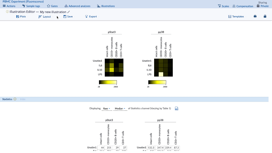
The desired statistic and equation (e.g. fold) can be chosen using the Statistics menu under the plots. Heatmaps can be made with any statistic, such as event counts, percent in gate, medians, as well as ratios of these statistics compared between samples (e.g. fold change of event counts). When using a comparison equation, make sure to set the control appropriately. By default, the control cells value will be highlighted on the statistic table.
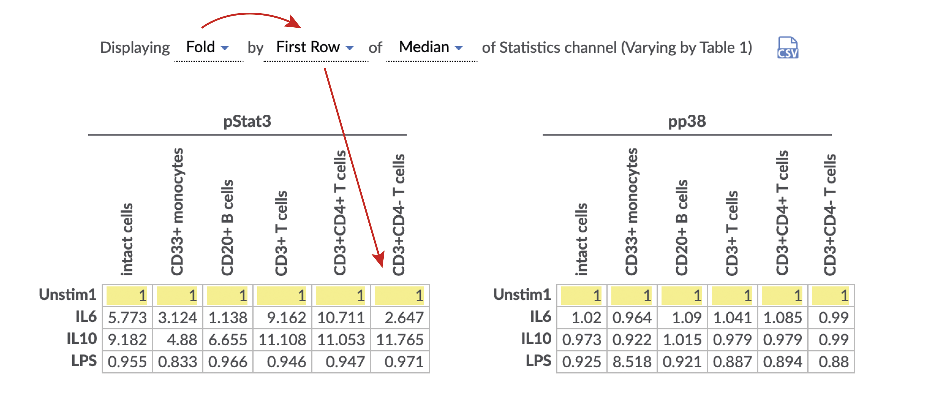
(Specify the statistic and equation for the heatmap. Control cells value is highlighted in yellow)
The equation can only be changed on the Statistics menu. However, the statistic can be selected through the Plots menu of the Illustration Editor navigation bar, hovering the mouse over the heatmap or through the More plot settings menu. The table of statistics can be exported as tab-delimited data clicking on the CSV icon at the right of the Statistics menu. Read more about statistics and equations in the Illustration Editor.
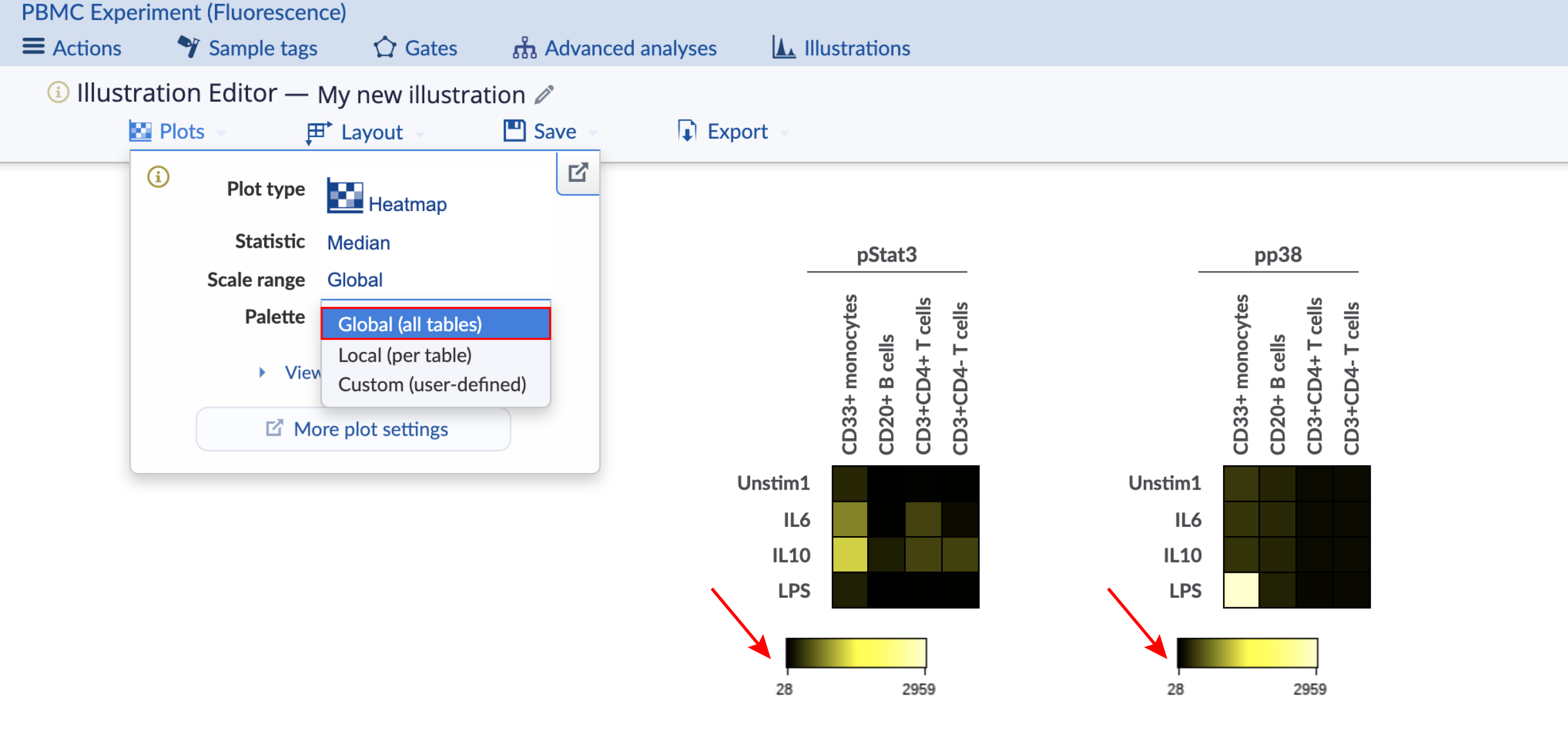
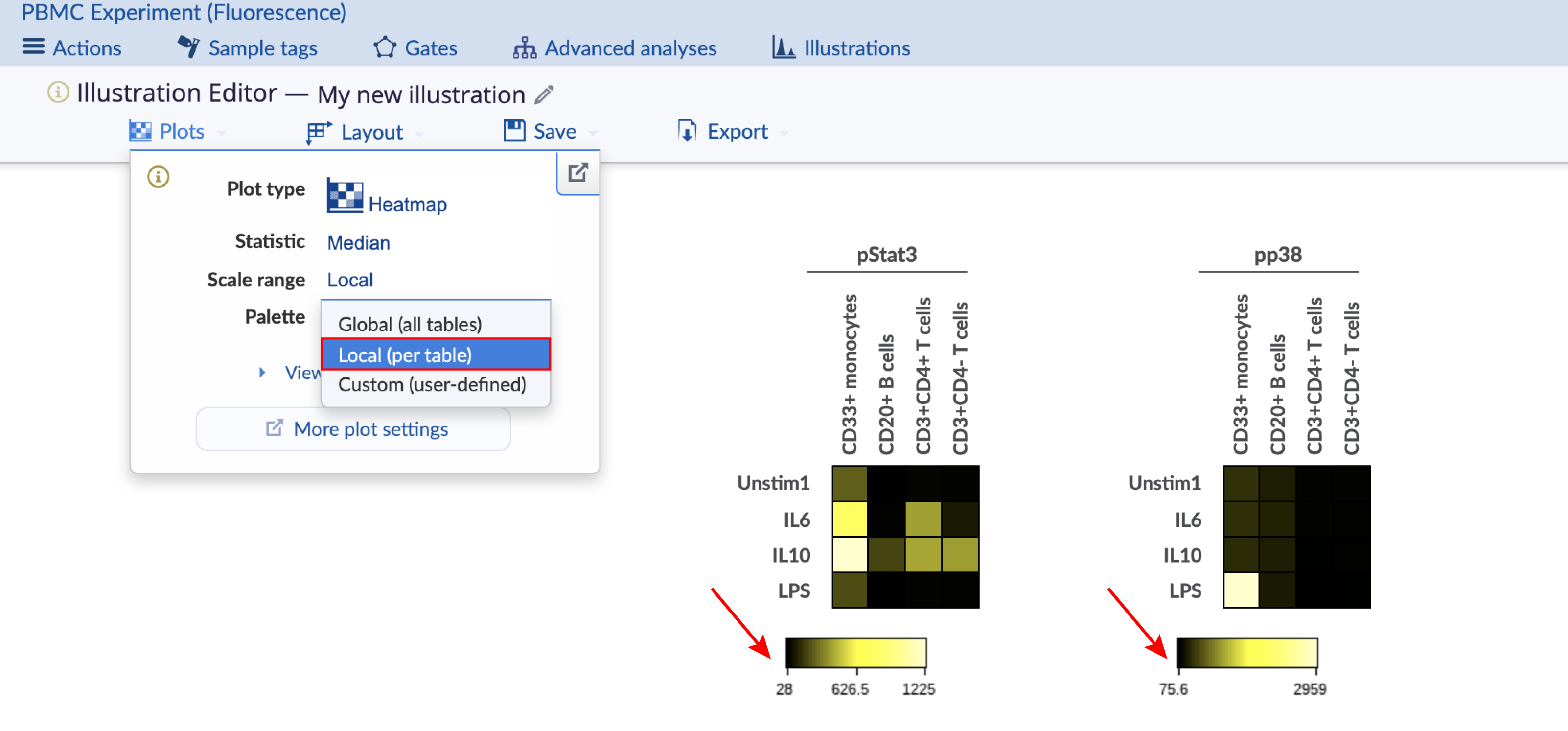
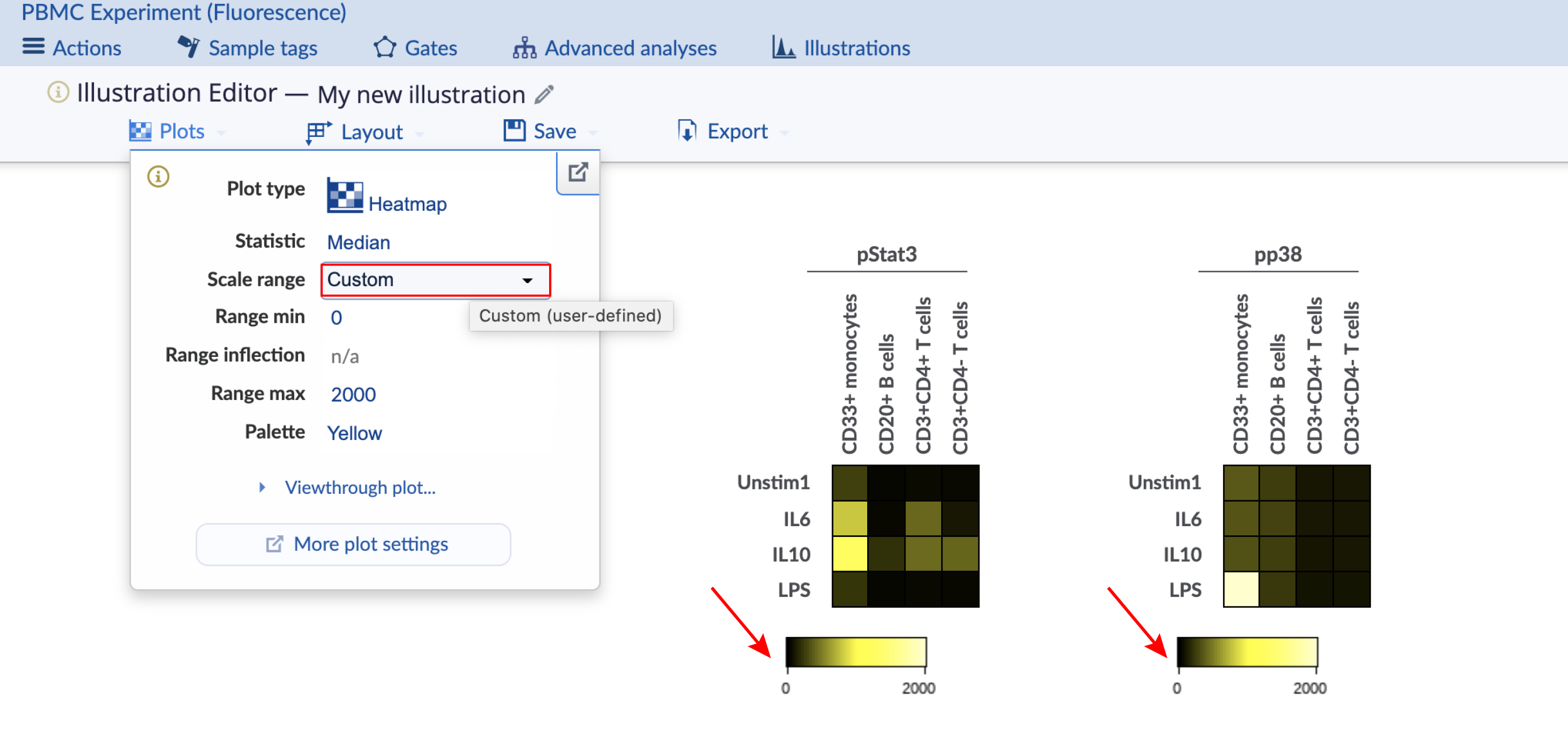
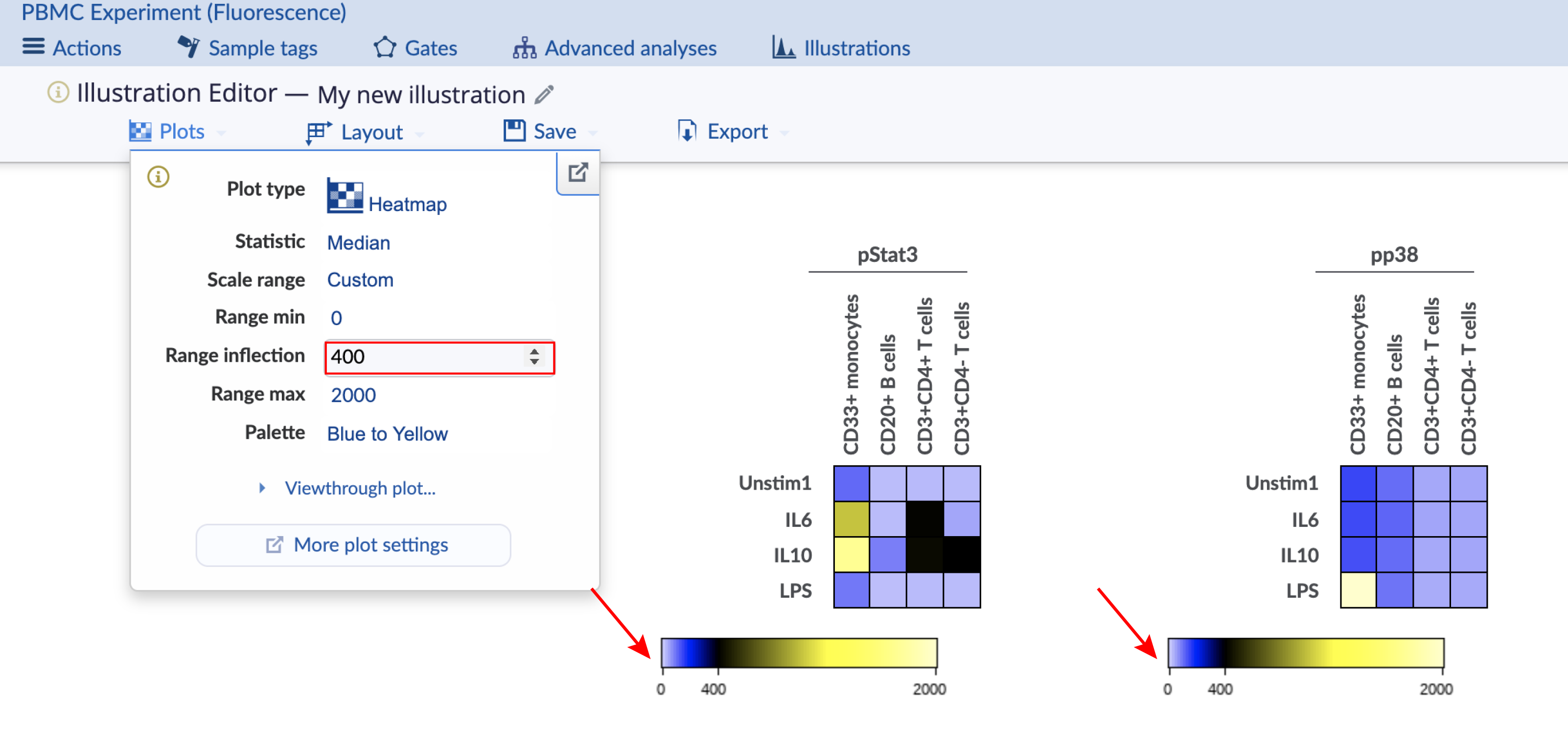
4) Setting the heatmap coloring range: global, individual, and custom
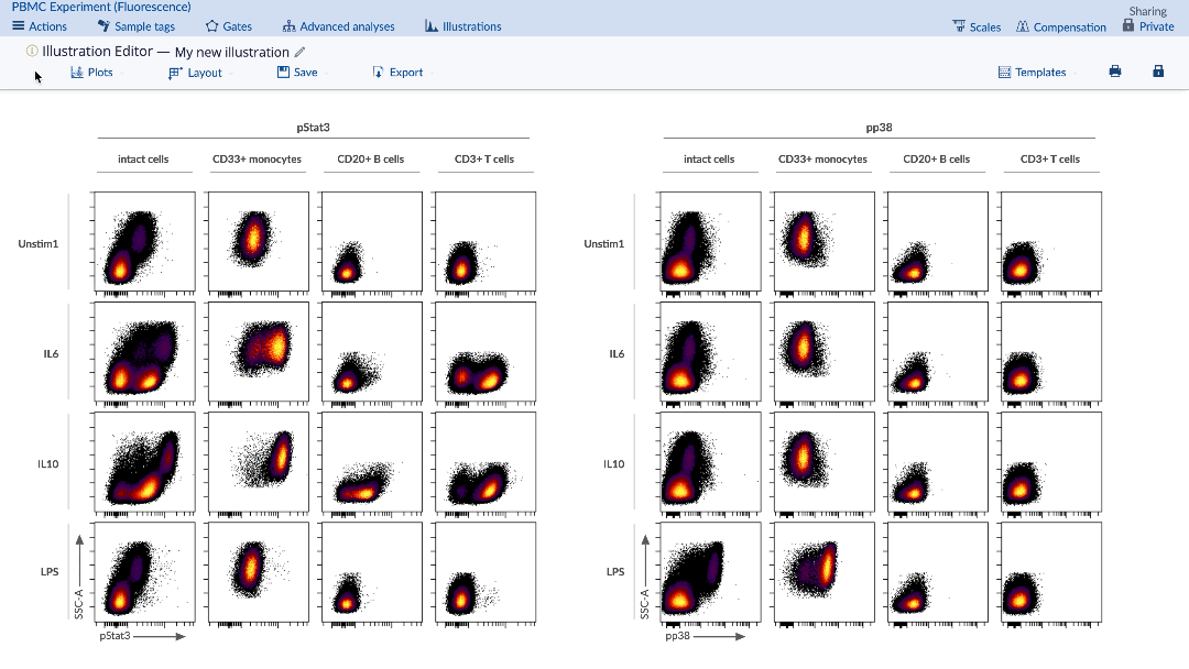
The heatmap coloring range is the range of the color bar below the heatmap. Consider the images below with four different configurations of the same heatmap illustration, which has two heatmaps displaying data for different channels. The important configuration differences between the four heatmaps are indicated and show the different ways to scale the coloring range across heatmaps. This experiment is publicly available on the Cytobank platform with the name "PBMC (fluorescence)". Clone it to follow along. There are three ways to change the scale range:
- Click on the Plots tab of the Illustration Editor navigation bar and then select the option from the drop-down menu of the Scale range option.
- Hover the mouse over the scale bar below the heatmap and select the desired Scale range option.
- Open the More plot settings window and change the scale range at the Heatmap settings menu. You can access this advance settings window by double clicking on the heatmap or through the Plots tab of the Illustration Editor navigation bar.
Global: The coloring range is the same across heatmaps.
Individual: The coloring range is calculated per heatmap.
Custom range without inflection: The coloring range is user-defined and global.
Custom range with inflection: The coloring range is user-defined and global with an inflection point. Currently it is forced to use both sides of the color scale for this configuration.
5) Heatmap data scaling: raw versus transformed
Background on data scaling and heatmaps
An important concept in data visualization is the use of raw versus transformed data values. By default, heatmaps display statistical values and color themselves according to raw, unscaled data values. In order to visualize a heatmap with coloring and statistics according to transformed data values, the transformed ratio equation must be used (see section above). A control of table's minimum is usually appropriate to visualize an entire heatmap in scaled mode. When using a single heatmap with many channels, however, a control that normalizes each channel to itself is likely desired. Controls using column or row would be indicated for this, depending on how channels are arranged.
Consider the following example with a synthetic file. The file has four populations that are visualized in the heatmap. Their median values are 7.5, 75, 750, and 7500. When visualized in a raw fashion, the heatmap coloring is not very useful:
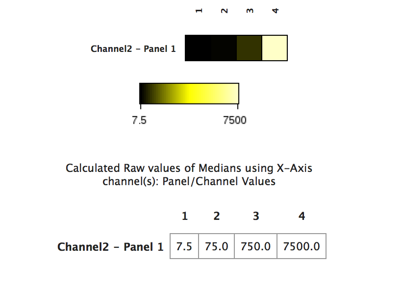
(Heatmap visualized with raw data - the data values in columns 2 and 3 are washed out by the value of column 4)
In order to view the data in the biologically more useful transformed space, the transformed ratio should be used. In this example, the scales are set to Log10 and thus the Log10 ratio is used. The transformed ratio automatically uses the correct ratio according to the scale settings of the channel being analyzed. Read more about statistics and comparative equations in the Illustration Editor.
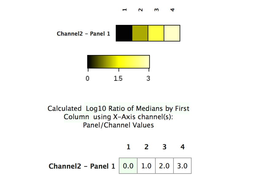
(The same heatmap as above visualized with transformed data values - the patterns in the data are now visible)
Practical example of data scaling and heatmaps
Below is a practical example of the theory discussed above. The figure shows a heatmap that plots numerous gated populations against a variety of channels in the dataset in order to see an "expression fingerprint" of the gated populations. The left side of the figure shows the heatmap with raw values. The right shows the heatmap with transformed values based on the transformed ratio of the minimum value in the heatmap compared to each datapoint within the heatmap. There is currently no option to use the transformed value of a data point in the absence of a comparative equation with a baseline (i.e., transformed ratio).
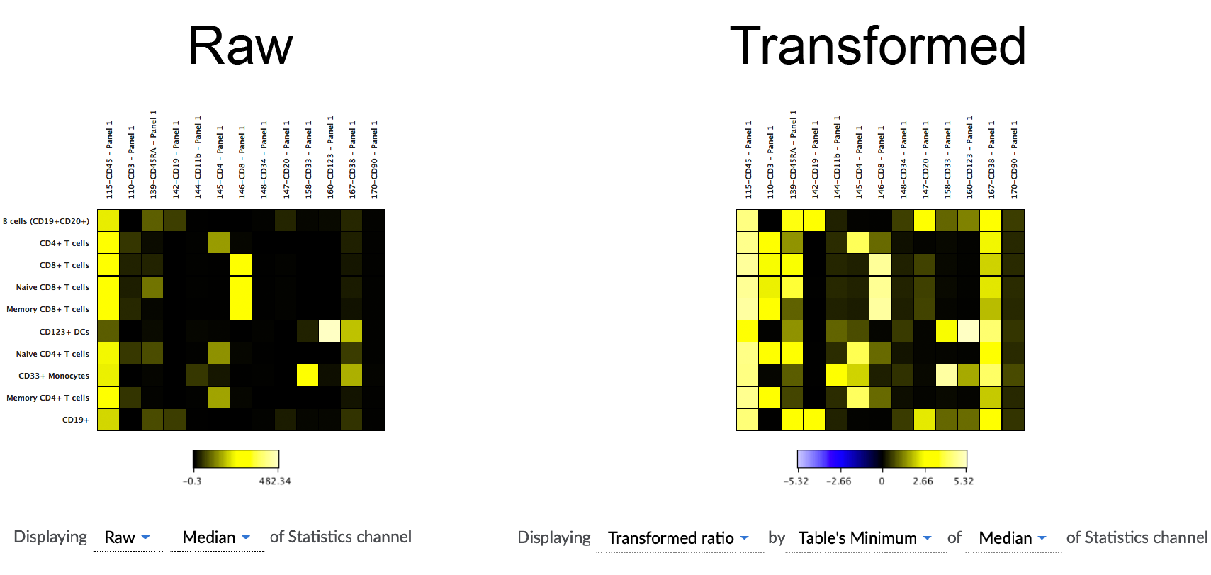
(a practical example of the difference that data scaling can make on the interpretation of data visualized in a heatmap. The data seen above are identical except for how they are scaled)
6) Mousing over a heatmap square shows underlying data
Hovering the mouse over any square on a heatmap will display the underlying data for that sample.
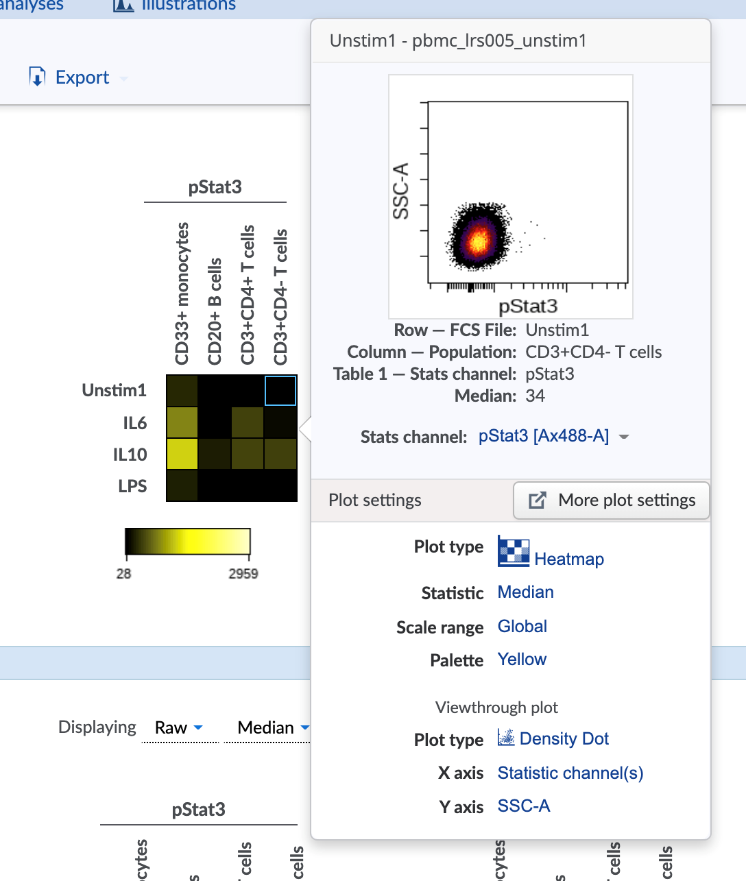
The type of plot that pops up and its axes can be set using the settings on the Viewthrough plot menu in the Plot tab of the Illustration Editor navigation bar.
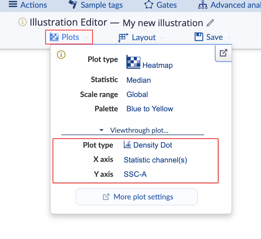
(Configure the viewthrough plot settings for mousing over a heatmap square)
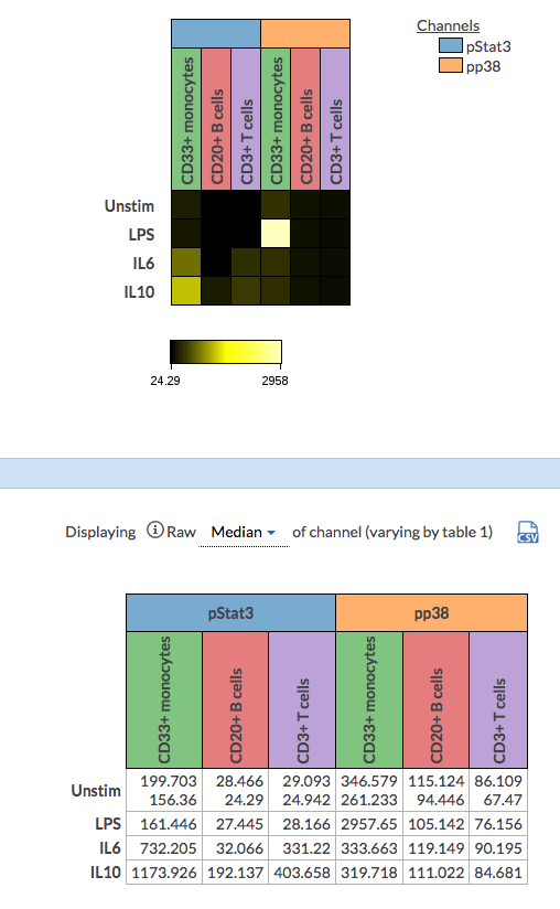
7) Dimension-annotated heatmap
Key features of the dimension-annotated heatmap
- Flexible design and customizable header settings
- Ability to show the aggregated value of multiple files
- Statistic table with the matching header setting of the heatmap
The dimension-annotated heatmap is available when the Collapse tables under the heatmap Plot type is toggled on. This will collapse your heatmaps based on your table dimension settings.
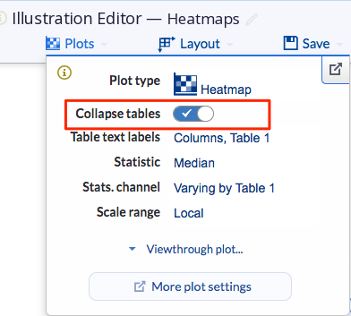
(Examples of heatmaps with Collapse tables on and off)

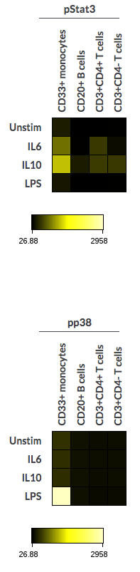
(Collapse tables toggled on(left) and off (right))
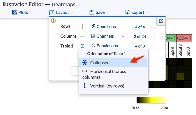
You can also choose which table to collapse in the Layout by changing the orientation of the table to “collapsed”.
The headers are customizable. When hovering over the table and column header, you may change the coloring of the header below the Header settings.
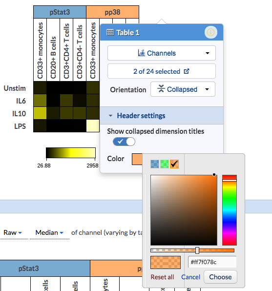
And if you toggle off the Show collapsed dimension titles, the dimension legend will show next to the heatmap table. This is helpful especially when the title names are too long to display on the table. You may customize the color by clicking on the legend to change to another color.

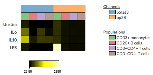
(Collapsed dimension titles toggled off for only the table dimension(left) and for both the table and column dimension(right))
If there is more than one file within a cell, the aggregated value will be shown for that cell.
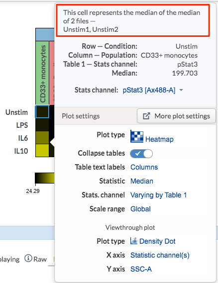
(There are two files within the Unstim condition (first row) and the cell value can be shown either as mean or median value of all the files within the cell)
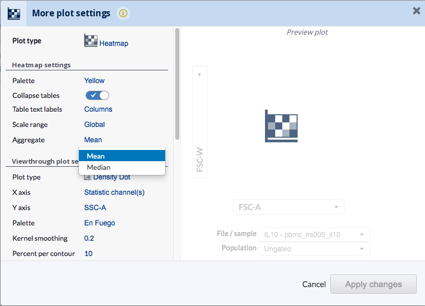
Selection of the aggregate statistics can be made by going to Plots>More plot settings, then choosing mean or median from the Aggregate under the Heatmap settings.
Another nice feature of the dimension-annotated heatmap is that the statistic table below has the matching header settings of the heatmaps.
8) Exporting Heatmap Image to PowerPoint or PDF
Normal guidelines for exporting images of figures apply also to heatmaps.
9) Heatmap Clustering and Dendrograms
The Cytobank platform does not currently support any downstream operations on heatmaps including clustering and dendrogram production. To complete this workflow, heatmap data can be exported from the Cytobank platform and imported into a different software package. Data can be exported directly from the Illustration or using the Export Statistics Tool. For tips on software packages for completing this workflow, or to request this feature, get in touch by making a support request.